Ember
You keep them afloat. Ember keeps it seamless.
One portal. Every person you love. Designed for the generation holding it all together.
Passion Project
AI Native
Lead Product Designer
Mobile app
The generation holding it all together - with tools that weren't built for them
Toggling between your infant's vaccination record and your mother's oncology portal at 11pm. Cross-referencing lab results you don't fully understand. Drafting appointment questions while managing your own health needs that keep getting deprioritized. This is the daily reality of 11 million sandwich generation caregivers - adults simultaneously raising children and providing care for aging parents.
The problem isn't a lack of health portals. It's a surplus of siloed ones - each requiring separate logins, separate mental models, no unified view. A caregiver managing three family members easily juggles five or six portal accounts with no way to see the whole picture at once.


Problem
Some startups have attempted family health coordination, but none have addressed the full stack: multi-profile management, privacy-controlled access, AI-powered clinical translation, and a design that holds the caregiver's own health needs alongside those of the people they care for. The gap isn't technical - it's a design and empathy gap.
The proxy access labyrinth
Gaining access to a parent's records requires separate paper forms, in-person visits, and 3–5 day processing windows - per health system. Once granted, it's buried in account settings, not a core navigation pattern.
Impossible context switching
Caregivers must log out and log back in to switch between their own records and a family member's - sometimes across entirely different apps - holding everything in working memory.
Designed for patients, not care managers
Portal UX is built around one person's journey. There's no concept of coordination across family members - no conflict detection, no cross-family medication review, no shared scheduling view.
Clinical language with no translation layer
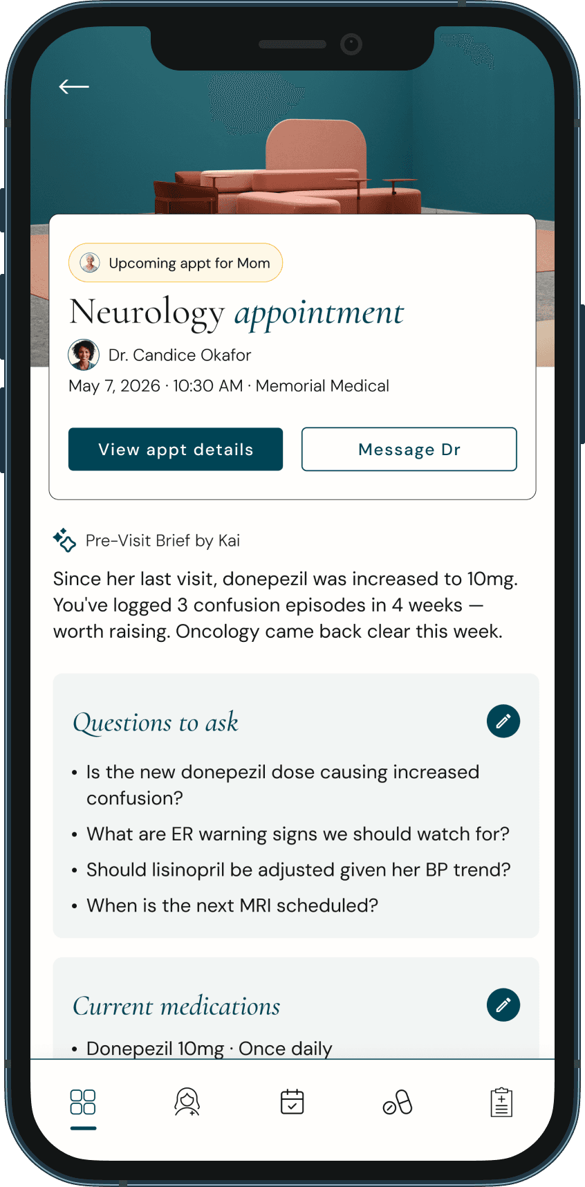
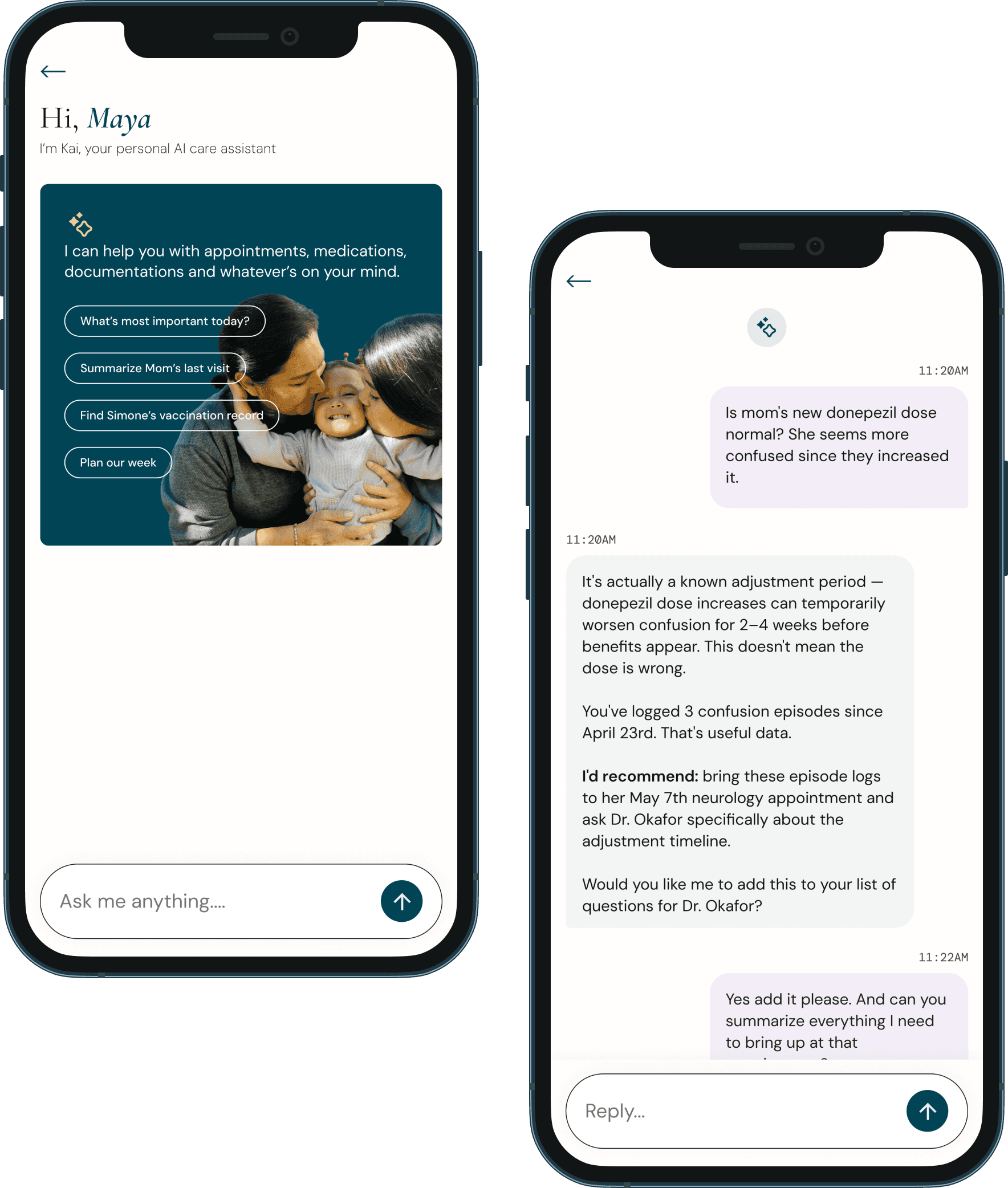
Lab results and after-visit notes are written for clinicians. Caregivers resort to Google and arrive at anxious, often inaccurate conclusions - without ever getting a plain-language answer.
Reactive, not proactive
Portals alert after something has happened. They don't surface upcoming refills, flag missed follow-ups, or notice patterns across visits. The caregiver holds all of this in their own head.
Research
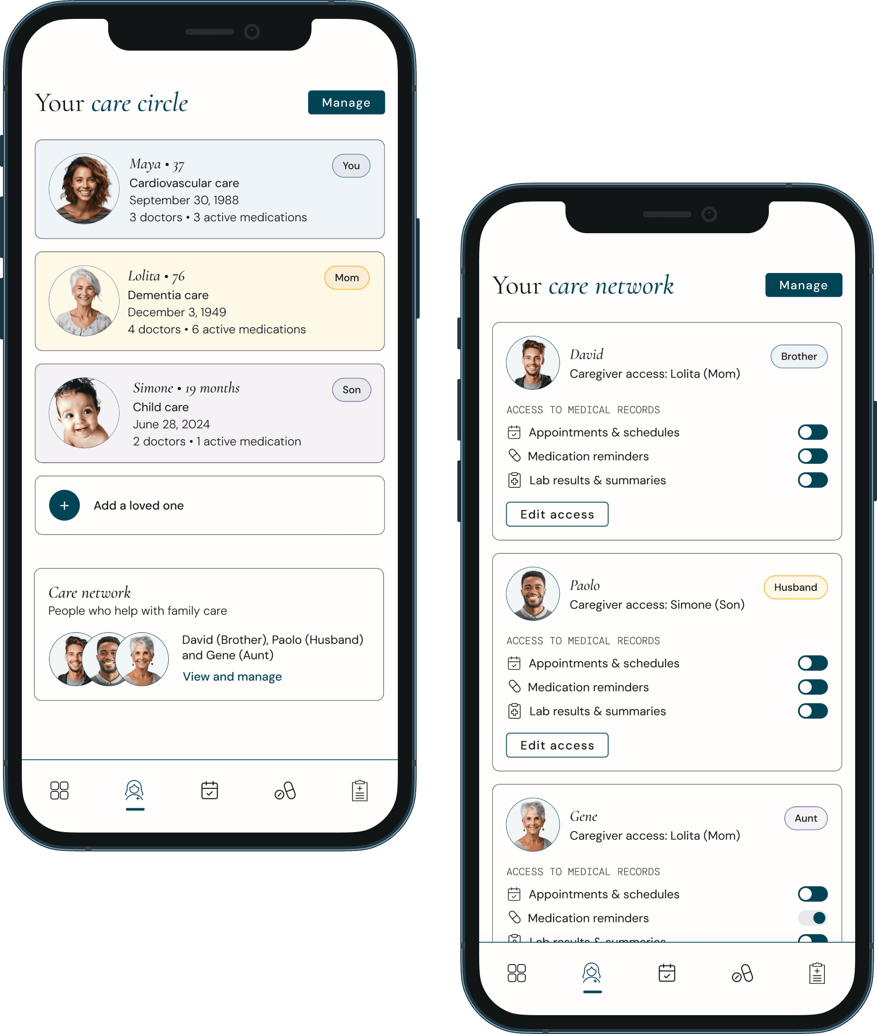
Ember serves a specific archetype - someone who is simultaneously managing their own health, their child's health, and a parent's health. This is not a passive patient portal user. This is an active care manager who needs tools commensurate with the complexity of the role they're performing.


Design Principles
One window, many lives
A caregiver should never have to leave the app to access information about any person they care for. All profiles, all records, unified - with no login switching.
Privacy is layered, not binary
Different people in the care network have different rights to different information. Access is granular, consent-first, and revocable - at every layer.
Surface what matters before it matters
The best tool for an overwhelmed caregiver doesn't wait to be asked. It proactively flags refills, flags follow-ups, and flags patterns - before they become crises.
Clinical language is a barrier, not a given
Every piece of clinical content (labs, diagnoses, after-visit notes) - must be translatable into plain language on demand, without minimizing the information's importance.
The caregiver is also a patient
Maya's cardiovascular follow-up is not less important because she's busy managing others. The product must hold space for the caregiver's own health with equal dignity.
Care is collaborative, not solo
Siblings, partners, and other family members often share caregiving responsibilities. The product enables distributed coordination without creating confusion or duplicated work.


A personal note
I designed this for my mom. And for my son. And for myself - the version of me keeping loved ones afloat while quietly treading water.
Caregivers today are managing more than ever - appointments, medications, records, follow-ups - across systems that were never designed to work together. That invisible load doesn't just exhaust you. It makes you feel like you're failing the people you love most, even when you're giving everything you have.
Ember is a concept project, but the problem it solves is not. The sandwich generation is real, the gap in tools is real, and the exhaustion of holding everyone's health in your head is very real. This is my attempt to design something that helps.
I used AI to rapidly map the competitive landscape of family health management tools - identifying where existing products like MyChart fall short for caregivers, surfacing research on sandwich generation caregiving patterns, and pulling statistics that validated the problem before I committed to a direction. What would have taken weeks of desk research compressed into focused working sessions.
In the early stages, I used AI to rapidly generate a wide range of feature directions before narrowing scope. It helped me get to "what are the features that actually matter" much faster than working alone.
On the risk of over-designing
The temptation with a problem this complex is to build everything - because the problem space legitimately contains everything. The discipline here was radical scoping: which features, if they worked perfectly, would move the needle most? The Care Circle Dashboard, Compass pre-visit brief, and unified timeline are those three. Everything else would be set for a Phase 2.

